
How to Build a Seamless User Experience in SaaS
By By Emily Dawson
A cleaner, more product-oriented page intro keeps the inner pages consistent with the premium SaaS direction used across the homepage redesign.
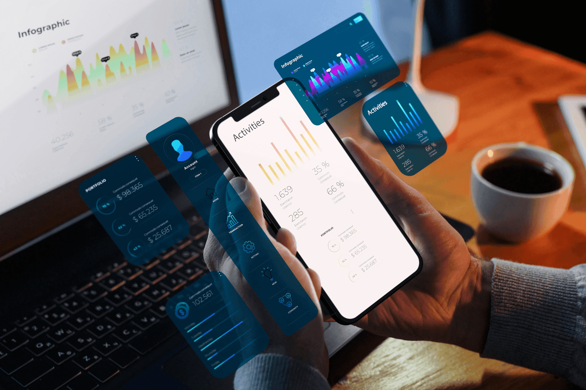
Mobile-first is no longer a nice-to-have — it is the dominant usage pattern for most SaaS products. Treating mobile as a downsized version of desktop leads to cramped layouts, slow interactions, and frustrated users. Design the essential flows for a 375px viewport before scaling up.
Mobile networks and devices are wildly uneven. A dashboard that loads in 400ms on desktop can take six seconds on a mid-range phone over 4G. Measure real-world performance, not just lab scores, and set budgets for JavaScript bundle size, font payload, and image weight.
Primary actions belong in the lower third of the screen where thumbs can reach them. Hit targets should be at least 44px square. Swipe, long-press, and pull-to-refresh reward users who expect them — but never hide critical actions behind gestures with no visual affordance.
“If the workflow hurts on mobile, the product loses — even when desktop usage looks healthy.”
Keep a drawer of older phones for QA. Emulators miss the quirks that real users hit: flaky biometrics, aggressive battery savers, weird viewport insets. One afternoon with a mid-range Android catches issues no Chrome DevTools device emulator will.
By By Emily Dawson

By By Sarah Johnson

By By Emily Dawson